Component library
A structured, reusable component set in Figma, buttons to complex patterns.

Scalable component libraries, tokens, and documentation so your team ships consistent UI at speed.
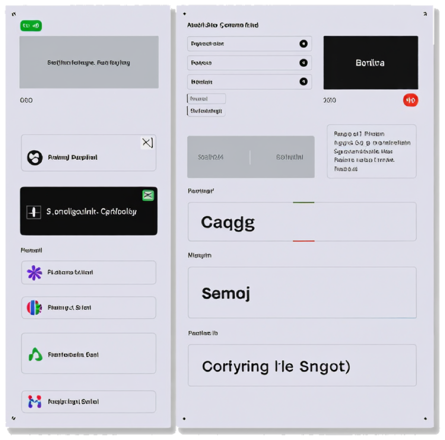 Component libraryDesign tokens
A structured, reusable component set in Figma, buttons to complex patterns.
Color, spacing, and typography tokens ready to sync with your codebase.
Usage rules and do/don't examples so the system survives team changes.
A contribution model and rollout plan so the system gets used, not shelved.
We dive into your brand, goals, and audience to understand what makes you unique and where you want to stand out.
We build a solid foundation for your brand, how it speaks, and what it stands for, to guide all your future actions.
We create a cohesive, memorable visual experience that feels consistent, professional, and authentic to your brand's story.
We build and deliver all the assets and tools you need to launch your brand and keep it growing.
Final assets delivered in production formats, print PDFs, source files, and web-ready exports.
Every asset is built inside your brand system, or we help define one first.
You own the working files, not just the exports, no locked formats, no hostage assets.
Yes, most system projects start by auditing and consolidating what exists rather than redesigning from zero.